Your website is leaking revenue for your SaaS business, and you don't even know it.
In today's fiercely competitive digital landscape, a poorly optimized website can severely hinder your business's growth potential and result in missed opportunities.
Having a low conversion rate increases your customer acquisition cost, making it challenging to sustain profitability.
While your competitors, who have invested in optimization strategies, are capitalizing on their higher conversion rates, gaining more market share, and leaving you struggling to keep up.
Lack of awareness, limited resources, not having a data-driven approach, and the right skill sets stop founders from creating a more optimized website. But your business deserves to thrive, attracting and retaining customers who recognize the value you bring to the table.
 Anthony Witherspoon
In this blog, we will dive deep into the world of simple yet highly effective optimization strategies tailored explicitly to SaaS products.
Equip yourself with actionable insights and proven techniques to skyrocket your website conversions, leading to increased revenue, accelerated growth, and a more substantial market presence.
Boost your conversion with magnetic headlines
The headline is the first thing that your visitor sees. It’s like the virtual storefront of your website, captivating visitors and enticing them to explore further. It’s not just a string of words; it's the gateway to your brand's story.
After reading your headline, people will instantly decide if they want to keep reading or not.
Optimizing your headline to grab the reader's attention is one of the best and simplest ways to improve your conversion rates.
As legendary copywriter David Ogilvy said, "On average, five times as many people read the headline as they read the body copy. It follows that if you don’t sell the product in your headline, you have wasted 80% of your money.“
Your headline should be memorable and leave a lasting impact. A well-crafted headline can be the driving force behind conversions, as it sets the tone for the rest of your website and influences the overall user experience. For a handful of words, a headline has a lot of jobs. A good headline will:
- Match what people expect to find on the page, so it should use similar words to the button or the ad they clicked on. People want to find the information they want so they won't leave quickly.
- Make people curious so that they keep reading the rest of the page. It can do this by showing the value or rewards they'll get or by promising something exciting and believable. A good strategy is to use your value prop on your headline.
- Make them understand the page's goal and ensure they're the right kind of visitor.
- Get straight to the point and write what people need to see shortly and clearly, ideally using 12 words or less. This helps improve the chances of getting people to take action and convert.
- It should highlight the main positive result people will experience after using your solution.
Let’s not forget about the trusted sidekick of headlines which are subheads. Subhead plays a big part in not only holding attention but also expanding on the headline and compelling readers to stay engaged.
It builds on the headline by providing additional details, benefits, or key features. It reinforces the main message and strengthens the value proposition, making it more appealing to the target audience. It creates a seamless flow, driving readers forward and encouraging them to explore more.
How to craft a powerful headline
Crafting an exceptional headline is no accident; it's a deliberate art form. But how does one create an attention-grabbing masterpiece that stops visitors in their tracks? Fortunately, there are tried-and-tested methods that top copywriters employ to achieve extraordinary results.
These powerful techniques, which you are about to discover below, are from the conversion copywriting master herself, Joana Wiebe, from her e-book Headlines, Subheads & Value Propositions: Nail the most important messaging and marketing copy you’ll ever write.
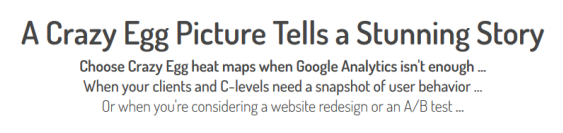
- Swipe headline copy from your prospect and customer - The best messages come from your prospects, not your thoughts. To create impactful headlines, borrow the phrasing used by your prospects. By aligning with your existing customer’s language, you avoid alienating skeptical visitors. Let your prospects shape your headlines and establish a genuine connection that captivates your target audience.
Look at this example of a Crazy Egg (2013), where the “tells a stunning story” part was swiped entirely from the customer.
2. Give a time limit -To create an enticing appeal, add a time limit to your claims. If your product can achieve X, specify a short timeframe, like hours, days, or weeks—not months or years. This taps into the desire for instant success, like lotteries and quick-rich schemes. By delivering fast results, you capture attention and ignite interest in your audience.
Example - Transform Your Body in Just 21 Days: Shed Pounds Rapidly with Our Proven Program
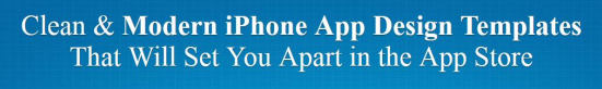
3. Make a believable promise -Promises and guarantees have immense potential. However, presenting them in a way that doesn't raise skepticism is vital. Striking the right balance is critical—elegantly delivering promises without seeming fake.
4. Craft promises that align with audience values, addressing needs transparently. Promises become powerful tools that inspire trust and drive conversions by striking this balance.
Here is an example from App Design Vault (2014) -
5. Crush your visitor's most compelling objections with your headlines -Your website visitors arrive with objections in mind. Focusing on just one objection in your headline can be incredibly effective.
By demolishing the biggest objection in your headline alone, people naturally assume you'll address the remaining objections. They may even forget their smaller concerns, as you've already tackled the significant hurdle.
A powerful headline and persuasive supporting copy instill belief in consumers who seek simplicity and crave a "miracle solution." They genuinely want to trust you.
Objection: Exercising is too difficult - it's only for highly fit athletes
Headline: Is This the World's Simplest Exercise Routine?
Here are some headline formulas before you go
FORMULA1: THE TIMED “OR ELSE” PROMISE
Highly desirable thing + time limit + consequence if highly desirable thing not delivered
Example - “Your Dream House Blueprints in 7 Days or They’re Free
FORMULA 2: THE “EVEN-IF” OBJECTION-STOMPER
“Now” + highly desirable thing you can do + “even if” objection
Example - “Now You Can Build an iPhone App Even If You’re Not a Programmer”
FORMULA 3: THE HOW-TO
“How to” + [verb + noun] + benefit
Example - “How to Support Customers 7x Faster with GizmoJo”
FORMULA 4: THE QUANTITY
FORMULA A: [Numeral + noun(s)] + verb + object
Example - “64,456 People Have Already Told Their Friends about Blastobot”
FORMULA B: Verb + [numeral + noun]
Example - “Made with a Special Blend of 11 Herbs & Spices”
FORMULA 5: THE LIST
FORMULA A: [Numeral + noun] + pronoun + big, scary problem
Example - “7 Signs You’re Trapped in a Contract”
Example - “The Top 16 Reasons Business Owners Choose to Bleed Time Using Spreadsheets”
FORMULA 6: THE WHY, WHEN, OR HOW
FORMULA: “Why,” “When,” or “How” + statement of great intrigue
Example - “Why SEO Is No Longer a Mystery”
Tap into emotions: Make your copy engaging with "You" centric copies
Making your website copy "you" centric creates a powerful connection with your readers or users. By addressing them directly and focusing on their needs and desires, you personalize the experience and make them feel understood.
It is natural to talk about your company but using "me, we, us" language can alienate readers and make them feel you only seek to satisfy your sales target.
When you tap into your customer's emotions using a "you" centric messaging approach, the product becomes about them. What can you do for them? Which is what customers care about
The user-centric approach builds trust, relatability, and a stronger connection, dramatically increasing the conversion and highlighting the value the product can bring to their lives.
Example of you-centric messaging: (2016) -
Double your success by mastering the art of effective pricing strategies
No matter how useful a SaaS product is, it isn’t worth much if you can’t get people to subscribe.
Most of us understand that we need a strategy for our pricing but can’t do it correctly. Before we get into that, let’s explain what a price anchoring strategy is.
According to Parkersoftware, price anchoring is where you supply an ‘anchor’ price to a potential customer before you suggest or show them the option you want them to choose.
It’s where companies establish a price point that customers can then refer to help them measure their options and decide. So, you use a price to create a frame of reference for the customer when valuing your product.
In other words, anchoring is the occurrence that sees consumers use the first piece of information offered as a comparison point.
Here's why price anchoring works
Our brain loves it when it can narrow down options easily. Narrowing down options helps your prospects make decisions faster, leading to increased confidence in their choices.
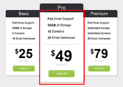
And the best way to do that is to keep three tier pricing options for two specific reasons.
- Goldilock Principal -This principle suggests giving prospects three or five options to choose from because our brain thinks the option in the middle is the best choice.
By following this principle, we make the other options less appealing to guide people toward choosing the middle one we want them to pick.
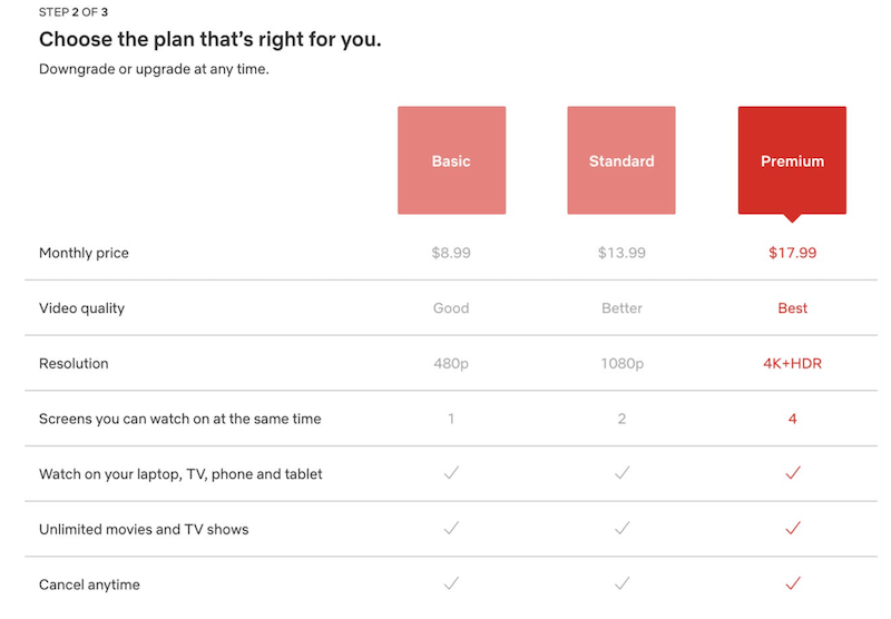
Source: https://blog.hubspot.com/sales/goldilocks-effect-pricing
In this scenario, the premium plan doesn't offer significantly different or more practical benefits than the standard plan but is priced much higher. On the other hand, the basic plan has lower video resolution than the standard plan.
This setup triggers the Goldilocks Effect, where most consumers will prefer the standard option. They perceive the premium option as too expensive and the basic option as not offering enough value for the discount.
One option is too costly, one is too cheap, and the standard option is just right.
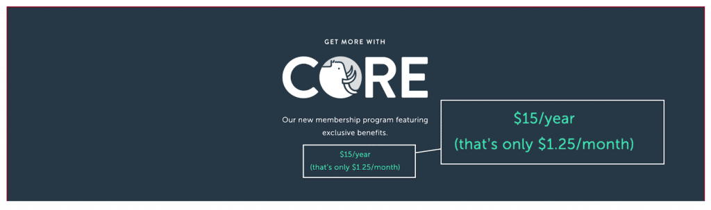
- The Ugly Jerry effect - The Ugly Jerry effect involves presenting three options: one distinct and two similar. The different options are ignored while the matching options are compared.
For example, if you prefer people buy the Standard Option, you would make the “Premium” option ugly, the "Standard" option the desired one, and another slightly inferior option placed alongside it to enhance attractiveness.
This technique guides decision-making by drawing attention to the desired choice.
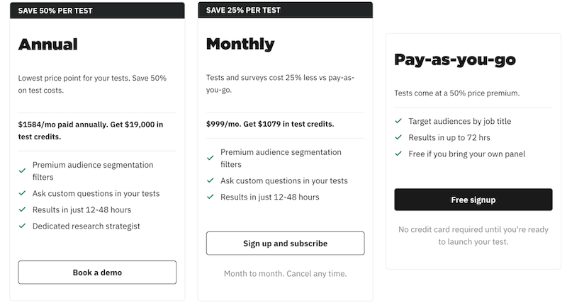
In this example from Wynter, they are trying to make the Pay-as-you-go option as unappealing as possible, first of all, deoptimizing from the rest and charging 50% more for the audience. While creating two similar offers with the more appealing offer in the middle.
Anchor your price according to your goal; anchor low to increase conversion. Place your higher price tier on the left, lower in the middle, and least desirable on the right. See an example below.
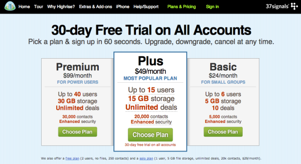
Source: https://www.paddle.com/resources/price-anchoring-to-optimize-your-pricing-strategy
To increase average order value but with fewer sales overall, anchor high, place the lower price on the left, higher in the middle, and the least desirable one on the right.
Example :
Source: https://www.bonzamarketing.com/4-examples-of-effective-anchor-pricing-tactics/
Some more pro pricing tips
- Always deoptimize the freemium package.
- Make your price(the number) as physically small as possible
- People respond better to long-term outcomes (They prefer big payoffs if it isn’t obvious)
- Break your cost into the smallest part. See the example below:
Source: https://www.invespcro.com/blog/price-anchoring/
Write succinct sentences. Say no to long paragraphs
A study from Nielsen Norman Group found out that 79% of people rarely read web pages word by word; instead, they scan the page, picking out individual words and sentences. Your online readers are either scanner scrollers or skimmers.
This is why writing short sentences on a website helps to convert better by enhancing readability and engagement. Short sentences are easier to comprehend and digest, allowing users to grasp the information quickly. They are particularly effective for websites, where attention spans are often limited.
By breaking down information into concise sentences, you make it more accessible and scannable for visitors. Short sentences help maintain a steady flow of information, preventing readers from feeling overwhelmed or losing interest.
Succinct sentences create a sense of clarity, enabling users to absorb key points and make informed decisions.
Additionally, short sentences promote better visual formatting.
Enhancing the overall readability of your website by preventing large blocks of text, which can be daunting and unappealing. Well-structured, concise sentences improve the user experience, making your content more inviting and encouraging users to stay longer on your website.
I have a rule that I follow when I write to help my readers understand my ideas. It also helps me think clearly when I write and edit; that is the rule of one.
One thought per sentence. One idea per paragraph
Having one thought per sentence and one idea per paragraph is crucial for clear and effective writing.
When you express a single thought in each sentence, your writing becomes concise and easier to understand. This allows readers to follow your ideas without confusion or overwhelm.
Similarly, dedicating each paragraph to a single idea helps readers grasp the main message of your content and improves readability. It creates a logical flow and smooth transitions between ideas.
By organizing your writing this way, you enhance clarity, and coherence, making your content more accessible and engaging to your audience.
Boost your home page performance using value proposition
A value proposition is a concise statement that communicates the unique value and benefits a product, service, or brand offers to its target audience.
And you can increase micro-conversion from your home page by using value proposition as your headline (and subhead) on your home page.
This theory was tested out by Copyhackers and resulted in an increased lift of an average of 34% from their 19 winning website. They have written an entire e-book on this experiment: The Great Value Proposition Test.
It answers the fundamental question of "Why should customers choose you?" by highlighting the specific advantages, solutions, or outcomes that differentiate your offering from competitors and address customer needs.
A strong value proposition should be
- Unique
- Desirable
- Succinct
- Memorable
- Specific
You should put more importance on specific characteristics than others. For example, it's alright to favor uniqueness over memorability as it's more important to communicate what your visitors want.
Remember: Differentiation is the foundation of the value proposition.
You can use a value proposition on your website to increase conversion rates because it effectively communicates why your product is one of a kind, addresses what customers want, and differentiates you from competitors.
It provides a clear and compelling reason for visitors to choose your offering, leading to higher conversion rates and improved business outcomes.
Now it comes to how you write your value prop.
The goal of your value prop headline is to grab visitors’ attention. Here are some headline formulas that you could use right away. Do make modifications, as formulas are just the perfect starting point to which you can add anything and would like to make your own.
- BENEFITS-FOCUSED STARTING POINT: The only way for _____ to _____.[plus benefit/outcome].
Example: The only way for businesses to streamline their operations and boost productivity effortlessly.
Using "only" is not always necessary when describing a unique approach. You have plenty of alternatives to convey your distinctiveness. Consider using phrases such as:
- the best way
- the most innovative way
- the beautifully designed way
- the shockingly simple way
- the budget-friendly way
There are numerous possibilities to explore. Begin by incorporating "only" into your sentence and then modify the wording to highlight your unique qualities.
- FEATURES-FOCUSED STARTING POINT: We’re the ones that _____.
Example: We're the ones that optimize your supply chain management. - BENEFITS- OR FEATURES-FOCUSED STARTING POINT: The only way to _____.
Example: The only way to streamline your project management and meet tight deadlines with ease. - GENERIC STARTING POINT: We do X, but the difference is _____
Example: We do task management, but the difference is seamless collaboration and automated workflows
Ignite action with irresistible CTA buttons
Your visitors cannot convert online without clicking a button.
The CTA button can either make or break your page, conversion rate, and your business. Therefore, it's crucial to treat it seriously.
When your visitors are in the place of the CTA button, it is the moment when you've done everything to address your visitor’s concerns and needs, highlighting the benefits of your solution in one action your visitor should take. It's the moment when the conversion happens.
Some common CTA buttons that you have seen before are:
- "Sign up now."
- "Buy now"
- "Get started"
- "Learn more"
- "Subscribe"
- "Request a demo."
- "Join us”
These buttons are commonly used as a starting point but must be optimized or ideal. In many cases, they are either the default button copy with a theme or created without much thought. Which comes with problems such as:
- The buttons don't convey the benefits of taking action.
- They don't align with the visitor's motivation or goal.
- They make it seem like an effort without explaining why it's worthwhile.
- Having buttons with similar appearances close together on a page confuses the visitor on which one to choose.
Calls to action are terrifying for your visitors. It is the place on the website with the highest anxiety. There is so much unknown content behind that button it creates suspense for your visitors. They think about
If clicking the button means more work for them
- Opening up to a page that the button copy didn't promise
- A paywall or barrier to getting what you thought you were about to get
- Another series of buttons to choose from
Diego Gomes
I hope you understand that writing CTA isn’t a piece of cake, and optimization is essential. There are two concepts that I found that work best to improve your CTA
- Using click triggers
- Lizard brain Test
Click triggers: Click triggers are persuasive messages placed next to your CTA button to reduce anxiety and encourage visitors to click. They eliminate barriers, alleviate concerns, and draw focused attention to your button.
Importantly, they appear at the perfect moment when a visitor's cursor is hovering over the button but has yet to be clicked.
Example of a click trigger -
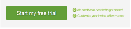
The copies “no credit card needed to get started” and “Customize your invites, offers + more” are your click triggers.
A click trigger should either a) address a significant concern that hinders your prospect from taking action you can find these concerns by simply doing customers research and interviews or b) enhance the value of proceeding by reminding them of their initial motivation for seeking you out, the benefits you offer, and the value they will gain.
If you provide an incentive, your click trigger can highlight that incentive.
There are two types of click triggers.
Simple ones - Simply place a few of these specific click triggers near the buttons on various website pages, such as the homepage, pricing page, comparison chart, sign-up page, upgrade page, and even the thank-you page.
- Fast Sign Up
- No Account Required
- No Downloads
- Buttons & Click-Boosting
- Calls to Action
- Free Shipping
- Next Day Shipping
- Free Returns
- 30-Day Money-Back Guarantee
- We Ship to the US, Canada & the UK
- Pay by VISA, MasterCard, or PayPal
- (star ratings)
- Save 20%
Aggressive ones - Effective click triggers that drive significant revenue are boldly assertive. They don't rely on ordinary copy but instead use captivating and attention-grabbing language.
These are particularly useful near buttons or crucial interaction points on pages just before the cart and on high-traffic pages, especially for PPC campaigns. Some examples are
- "Absolutely Zero Risk! Enjoy a full refund with no questions asked. You have a generous 90-day window to request it."
- "We Take All the Risk! Trust our 90-day no-questions-asked return policy."
- "1-on-1 Help from Judy O'Leary! Benefit from a dedicated team of specialists available to assist you any day of the week.
- "Talk with Judy! Receive FREE phone or email support from our committed team."
Lizard Brain Test - The lizard brain is a fundamental and instinctual part of our brain. It controls our survival instincts and automatic behaviors. Just like anxiety hinders visitors from clicking, not optimizing the button from design aspects stops our lizard brain from quickly noticing and trusting buttons.
Simplifying the design will make it easier for the lizard brain to navigate and take action.
For example: Which of these three buttons, from AcuityScheduling.com (2014), would attract a lizard’s eye?
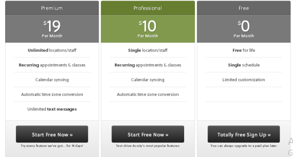
Here are some of the Dos for the lizard brain
- Keep the number of options small. Hopefully to 3
- Make your button big and front-and-center, with eye-catching images and arrows,
- Don’t let your brand color get in the way and go outside your brand color palette.
Avoid costly mistakes by testing
In a sales call, pitching to someone who has their camera off and is on mute would be unthinkable. You rely on feedback and interaction to gauge how your pitch is going. Unfortunately, many SaaS websites operate similarly.
The real value of a SaaS product shines through when people subscribe to it, no matter how useful it may be. That's why it's crucial to test different parts of your website, like buttons, headlines, visible pages, and offers. You can optimize your website's performance and conversion rates by testing these elements.
Testing allows you to gather data, analyze user behavior, and make informed decisions based on actual results. It helps you understand what motivates visitors to take action and identify potential areas for improvement.
Charley Gale
Continuously testing and refining your website can create an optimized user experience that maximizes conversions and drives sign-ups.
In the absence of real-time feedback, testing becomes even more crucial. Testing empowers you to iterate and improve based on data-driven insights, ensuring that your SaaS product delivers value and successfully convinces visitors to subscribe and become loyal customers.
Here are some testing methods I use
A/B testing: Compare two webpage versions (A and B) to see which performs better in conversions. Test elements like headlines, button colors, layouts, or calls to action to find the version that gets more engagement or conversions.
Tool you can use: VWO
Multivariate testing: Test multiple variations of elements at once to find the best combination. Understand how various factors interact with each other to optimize your website.
Tool you can use: VWO
Usability testing: Observe users interacting with your website to find usability issues and gather feedback. Identify navigation problems and areas where users may need clarification or support.
Tool you can use: Usability Hub
Copy validation - Copy validation, also known as copy testing or message testing, is a process of evaluating and validating the effectiveness of written content or copy. It involves assessing the messaging's clarity, persuasiveness, and impact to ensure it resonates with the intended audience and achieves its intended goals.
Tool you can use: Wynter
Like what you see? Why not gain exclusive insights from some of the leading minds in SaaS with a Future of SaaS Membership?